
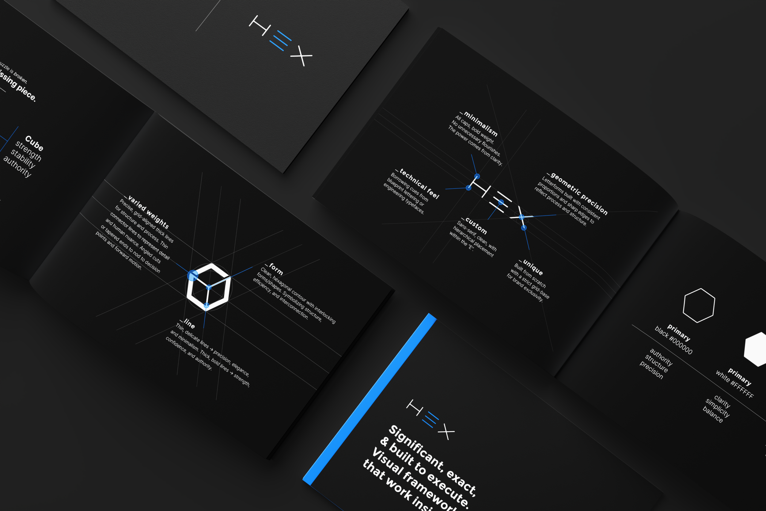
The creation of the HEX brand identity was built around a simple, provocative idea: The Missing System. The identity positions HEX not as another recruiting tool, but as a new operating discipline for C-suite leaders focused on scaling their businesses with greater clarity, rigor, and intention.
The visual language combines precision, intelligence, and confidence with a distinctive hexagonal framework—symbolizing the interconnected decisions that define leadership, culture, and organizational performance. Every element was designed to make executive search feel less transactional and more strategic: a disciplined system for identifying the right leaders, making better decisions, and building what comes next.
Significant, exact, & built to execute.
The visual system.
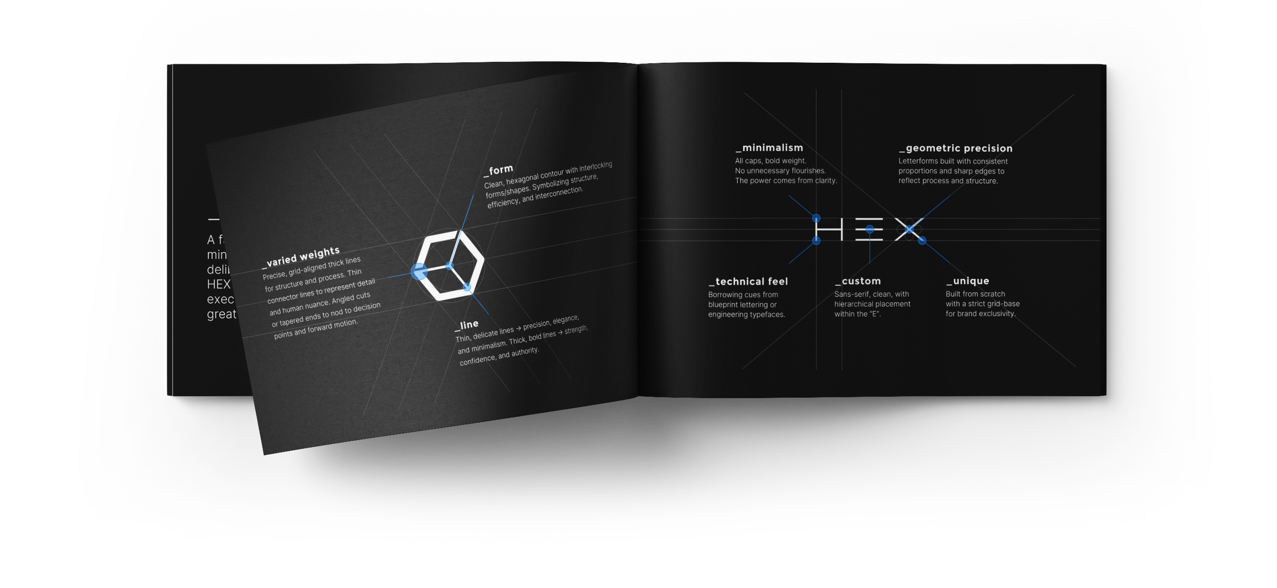
The visual system was built around the hexagon as a foundational device, representing structure, interconnected decisions, and the relationships that shape an organization. A modular grid, disciplined typography, precise geometry, and a restrained color palette create a system that feels intelligent and highly intentional. The visual language was designed to scale seamlessly across the brand, from digital interfaces and data visualization to presentations, communications, and environmental applications.
The expression.
Every expression of HEX was designed to feel precise, confident, and unmistakably modern. Bold typographic moments create authority, while modular graphics and connected forms introduce movement and dimensionality. The result is a visual identity that balances the credibility expected at the C-suite level with the energy and innovation of a technology platform.
Core associations.
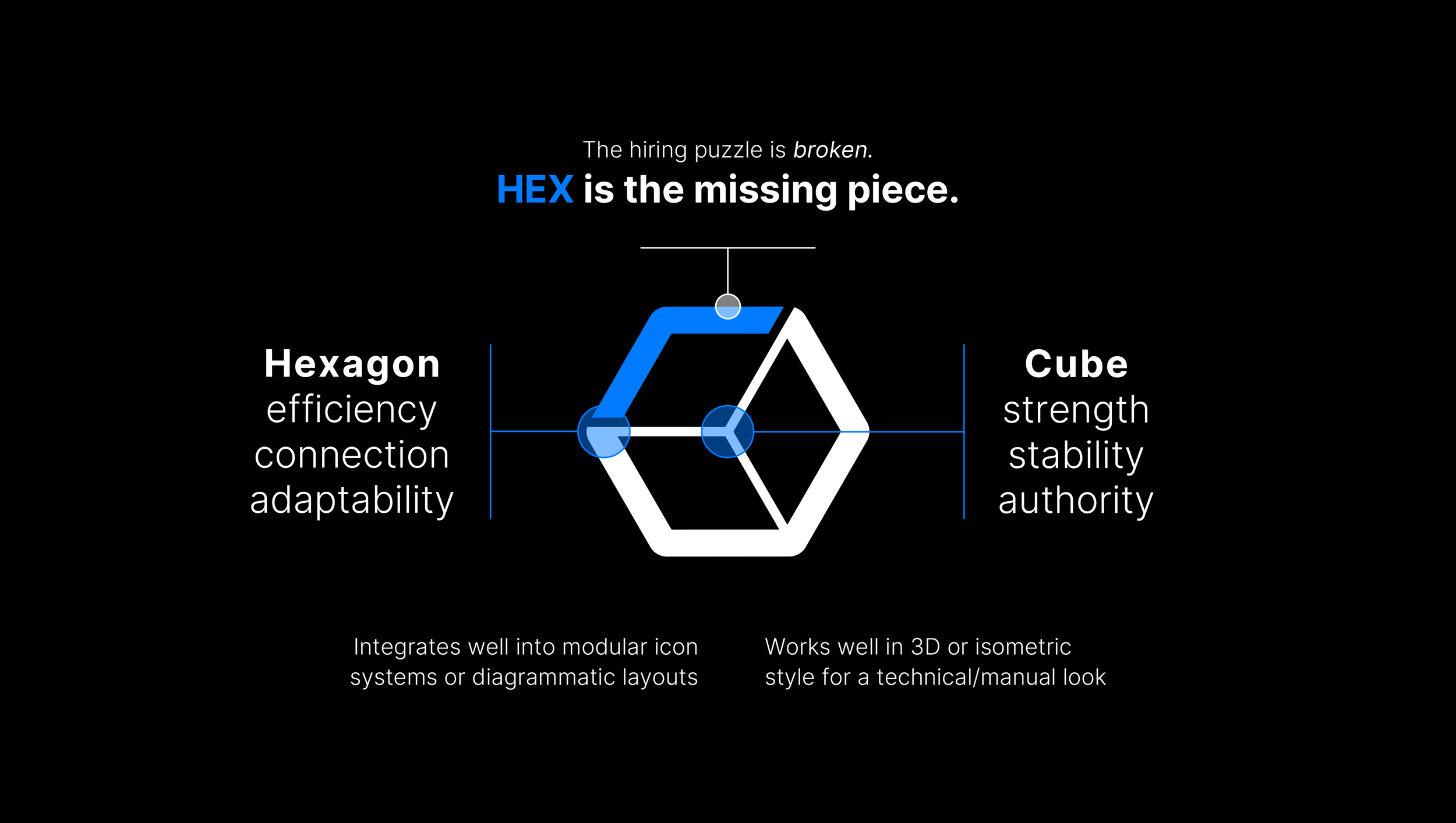
A subtle stylistic deviation within the system creates a deliberate sense of incompleteness, a visual nod to The Missing System. By introducing an unexpected break in an otherwise precise and structured language, the identity suggests that what’s missing isn’t a flaw, but an opportunity to rethink how the pieces connect.
Final touches.
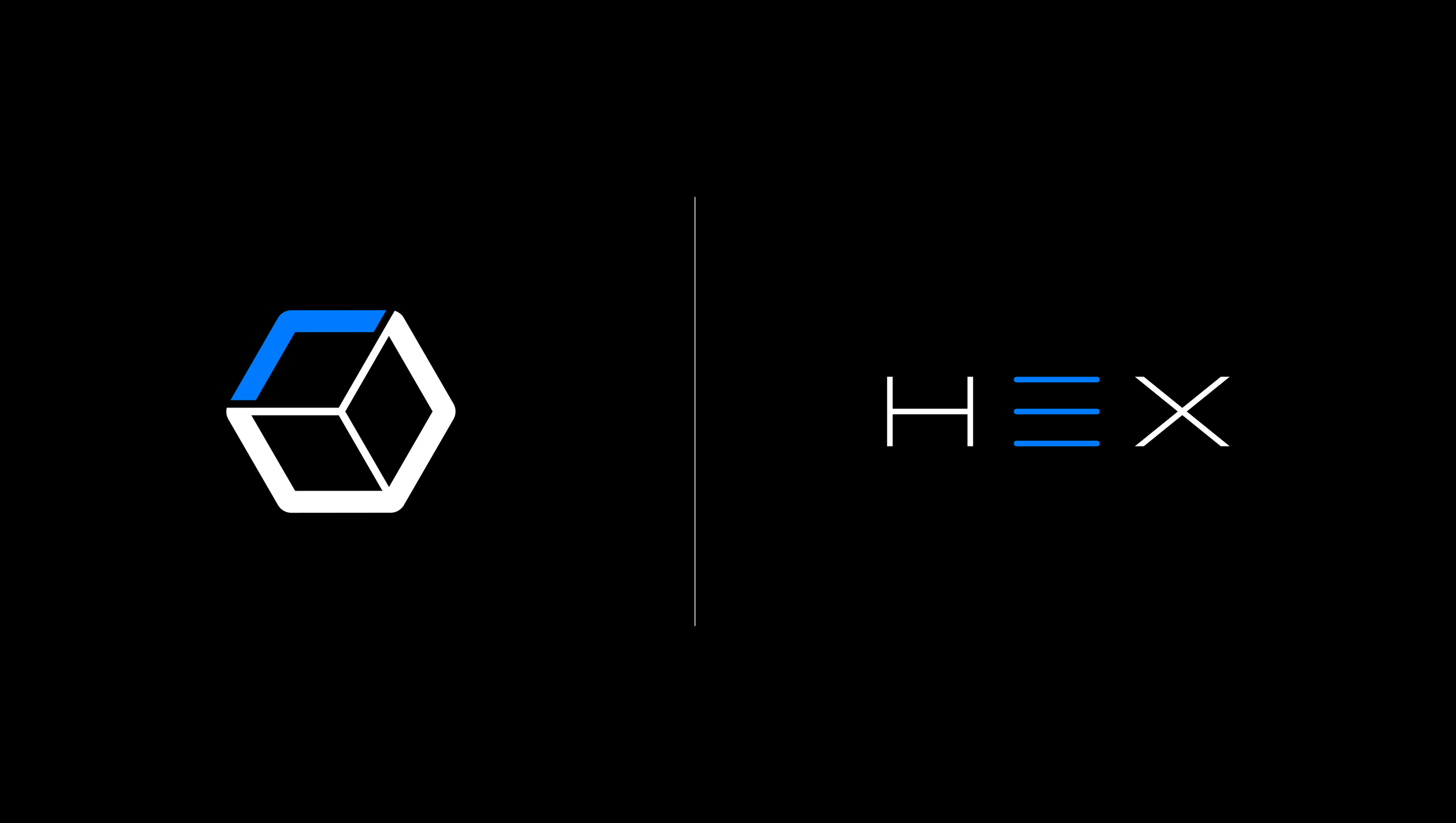
The final word mark and iconography were designed as a cohesive yet flexible system, allowing each element to stand confidently within its respective space. The word mark brings clarity and authority to primary brand expressions, while the icon provides a more compact, recognizable signature for digital interfaces, applications, and smaller touch points.
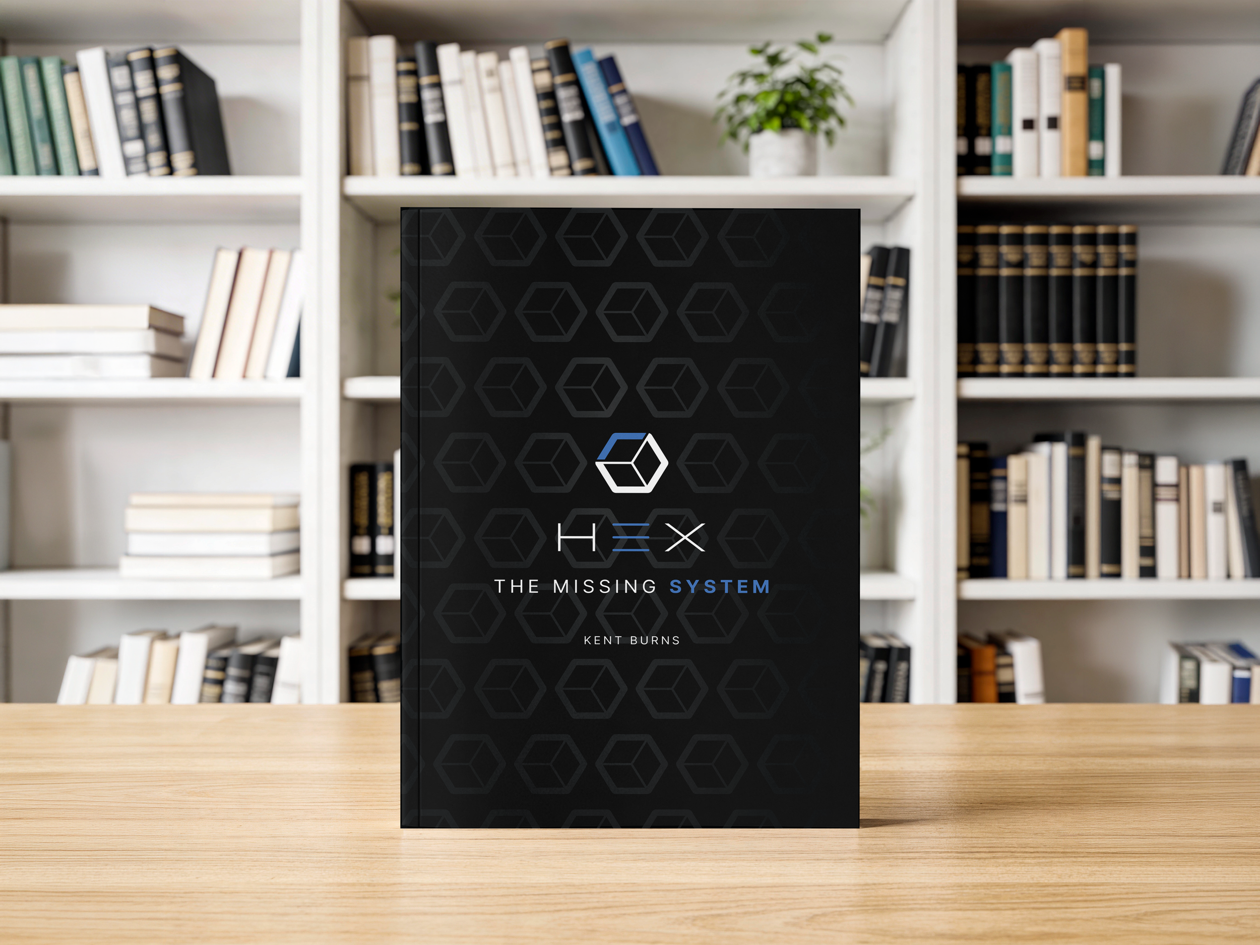
Brought to life.
Created The Missing System as the foundational book for HEX—a physical expression of the brand’s philosophy, visual language, and approach to executive search. Each page reinforces the idea that exceptional leadership isn’t found by chance. It’s built through a more intelligent, disciplined system. From the ingenious mind of Kent Burns.
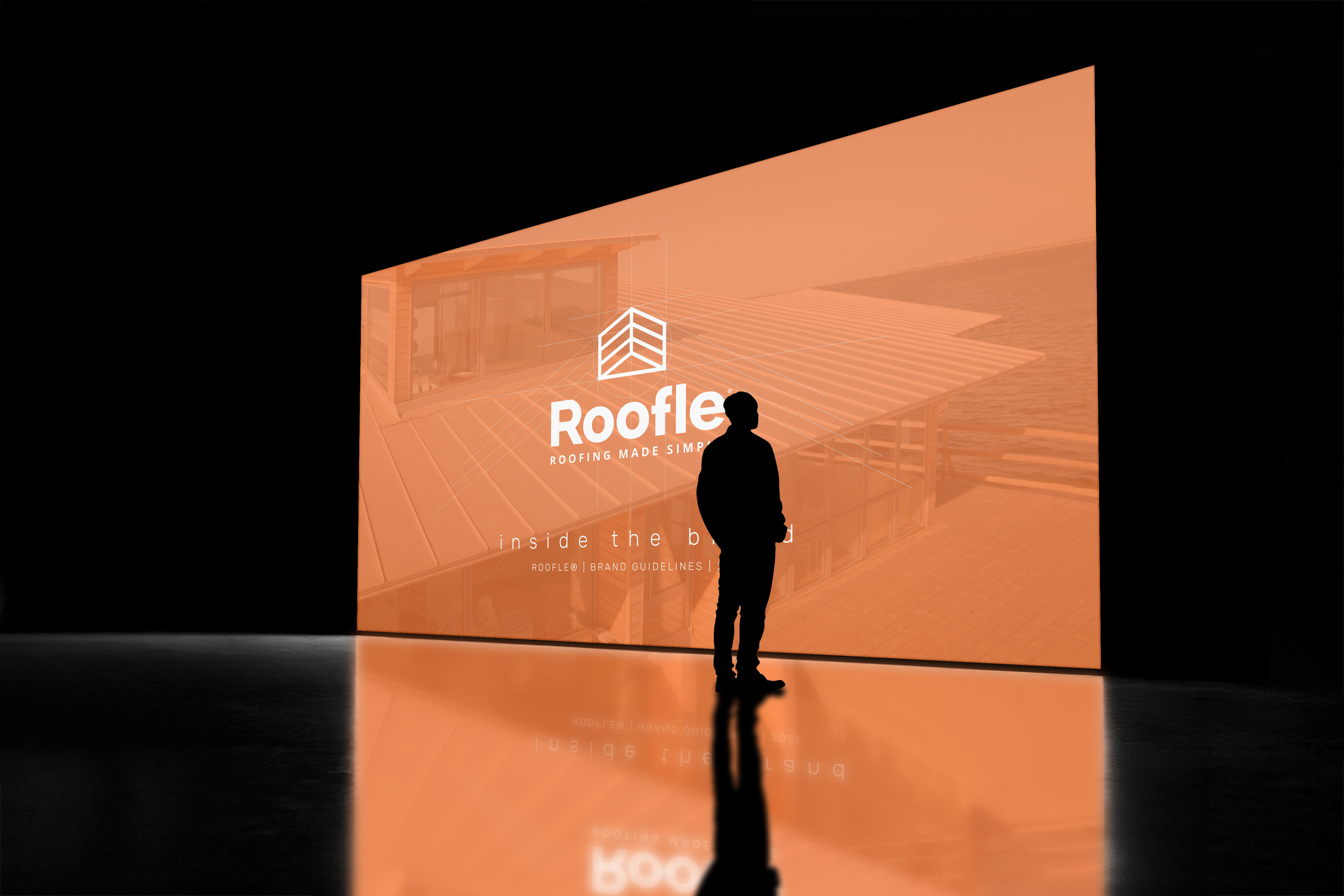
A scalable identity for a modern SaaS brand.
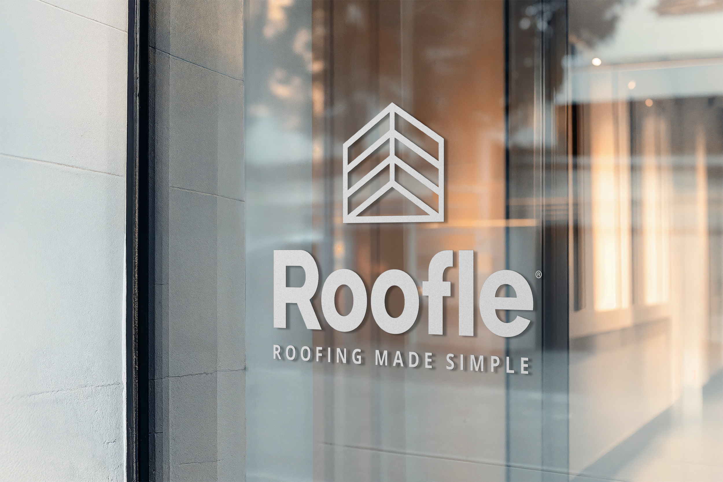
The brand guidelines created for Roofle, a roofing software platform specializing in lead generation and sales management, were designed to establish a clear, confident, and approachable visual identity within the roofing technology space. The guidelines define the brand’s core visual elements—including logo usage, color palette, typography, imagery, iconography, and overall visual tone. The identity balances the reliability and professionalism expected from a business software platform with a modern, energetic personality that reflects Roofle’s focus on helping roofing companies generate more leads, streamline their sales process, and grow their businesses. Together, the guidelines provide a flexible framework for maintaining a cohesive and recognizable brand as Roofle continues to scale.
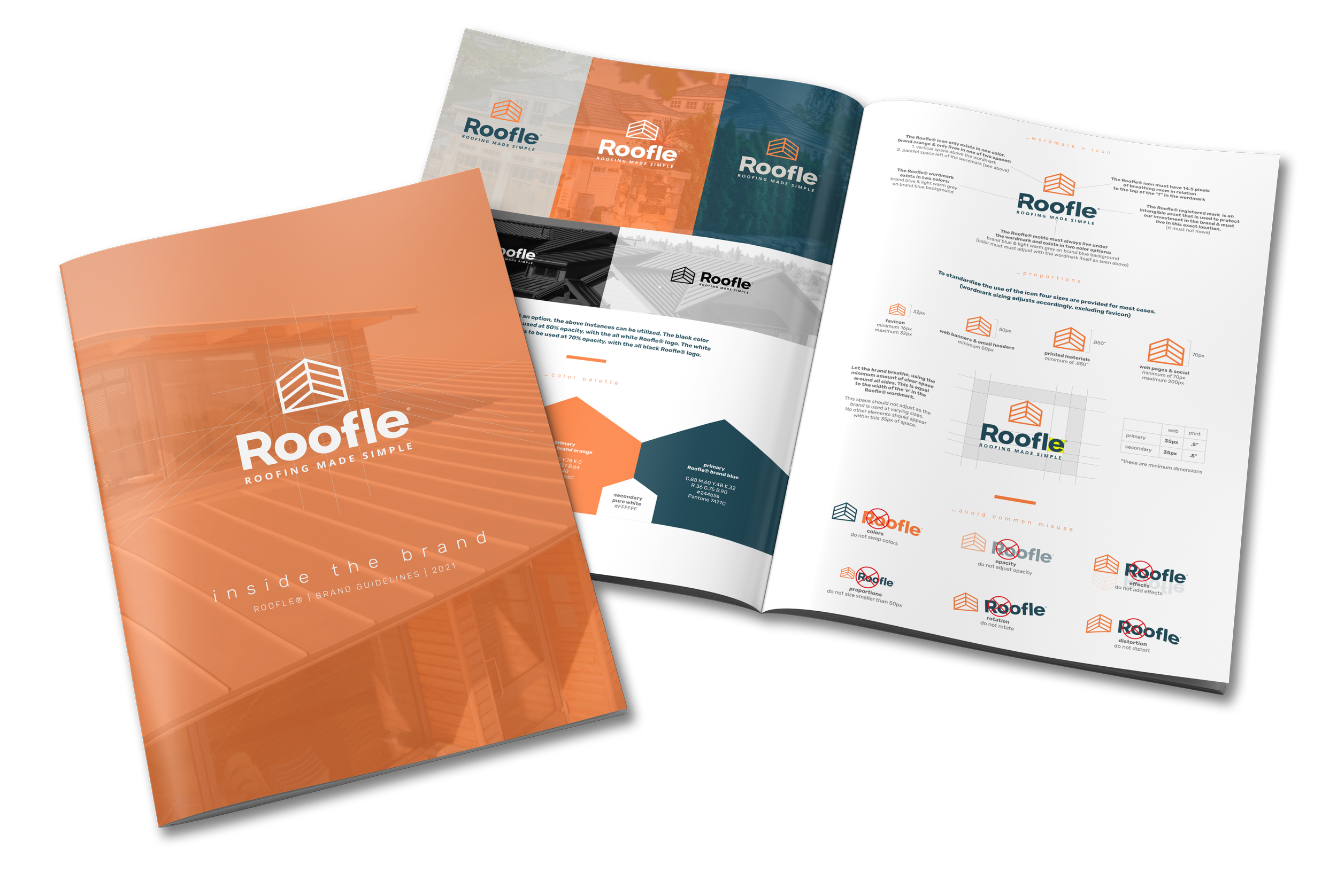
Designed to scale.
The brand identity cleanup for Roofle focused on refining and strengthening an existing visual system to create a more cohesive, polished, and scalable brand. As a software platform built to help businesses generate leads, streamline operations, and scale more effectively, Roofle needed an identity that felt as organized and efficient as the product itself. The project refined key elements including the logo mark, color palette, typography, visual hierarchy, and brand applications, removing inconsistencies while preserving the recognizable character of the existing brand.
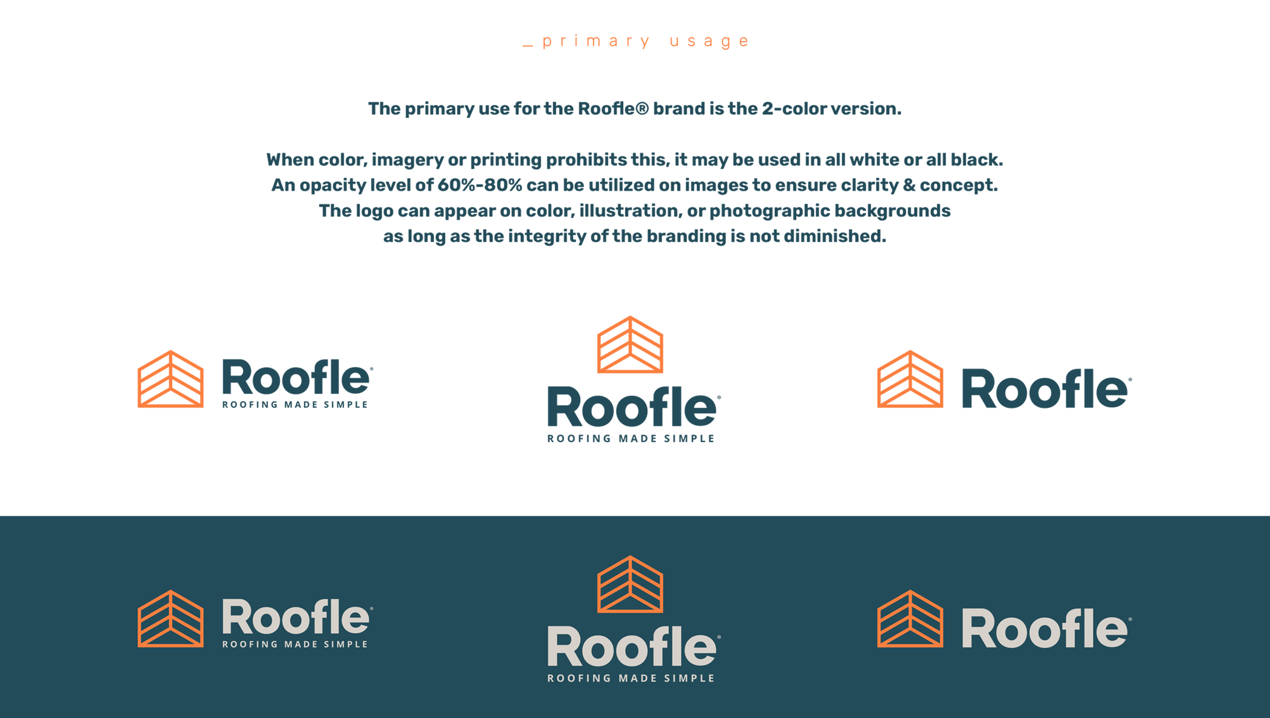
The nucleus.
The Roofle brand is designed to create a consistent, recognizable, and concise presence across all platforms . The core logo should be used whenever possible, maintaining its original proportions, colors, spacing, and visual hierarchy without alteration.
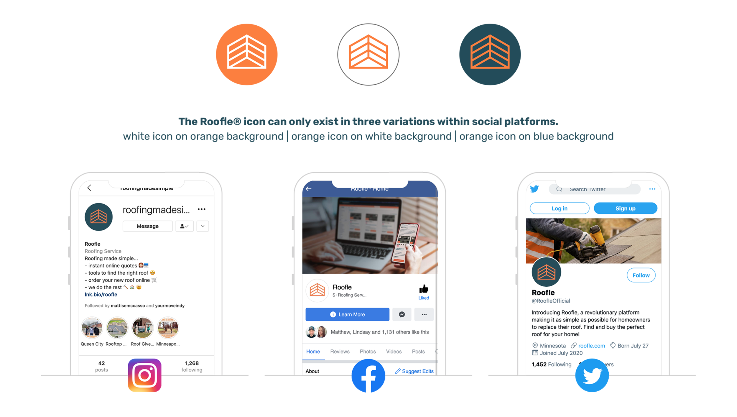
The icon.
Icons should remain clean, minimal, and consistent in weight, proportions, and style, using the established brand colors when appropriate. On social, icons can be used to highlight key features, communicate ideas quickly, support educational content, and create visual structure.
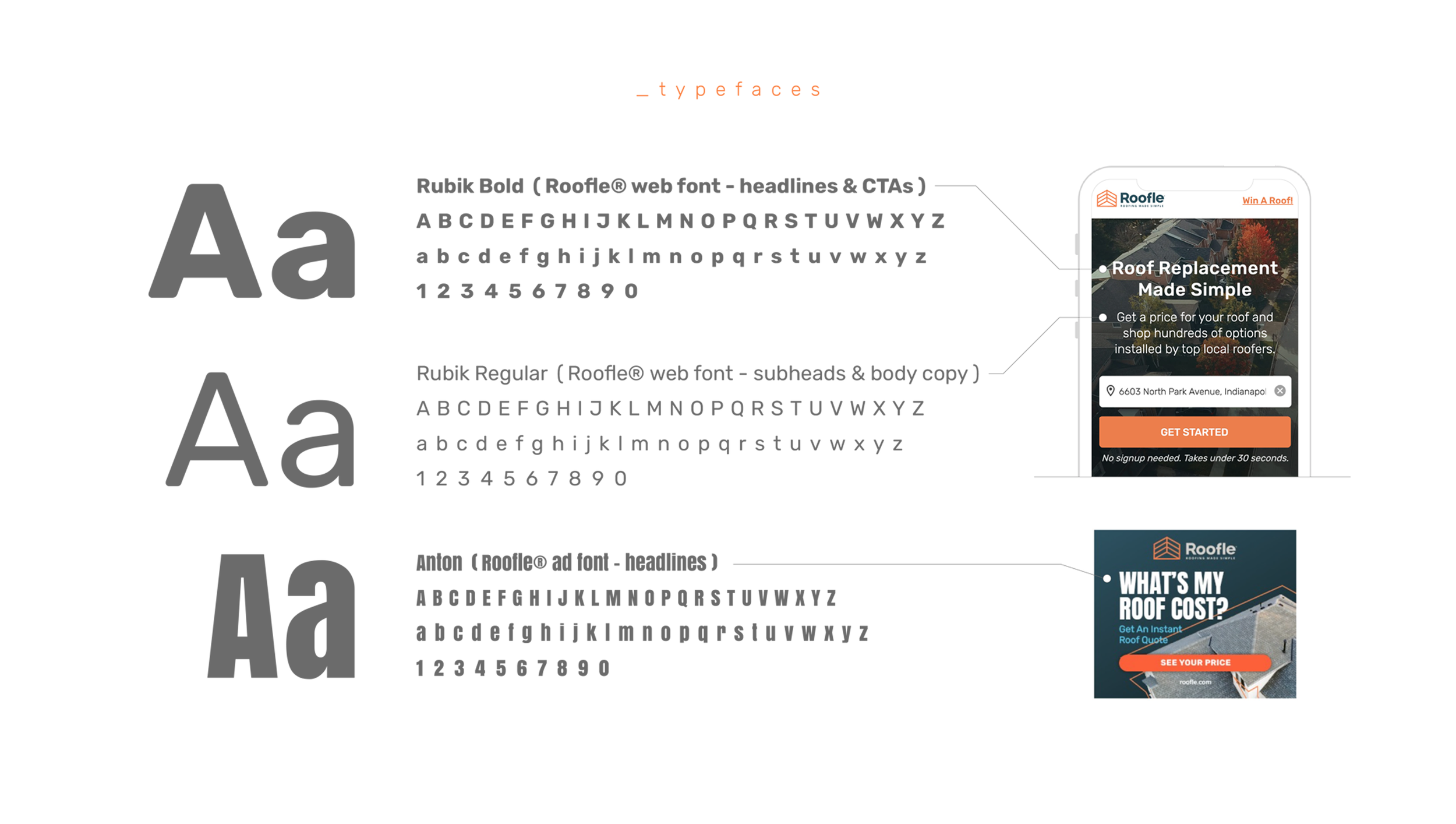
The type.
The Roofle brand uses Rubik and Anton to create a bold, modern, and approachable visual identity. Rubik provides a clean and highly readable foundation for supporting text and everyday communication, while Anton adds strong visual impact through its condensed, bold letterforms.
Odyssey Media Inc.
The rebrand marks the next chapter for Odyssey Media Inc., evolving the company’s identity to better reflect where the business was and where it’s headed next. Building on more than a decade of innovation, the refreshed brand brings greater energy, character, and cohesion to the way Odyssey presents itself. From its roots in traditional print media into a digital-first experience, transforming how audiences discover, engage with, and navigate content through a new, intuitive interface. The goal was to build an evolved identity to match. An identity that feels digital at its core, human in its approach, and relevant to the audience.
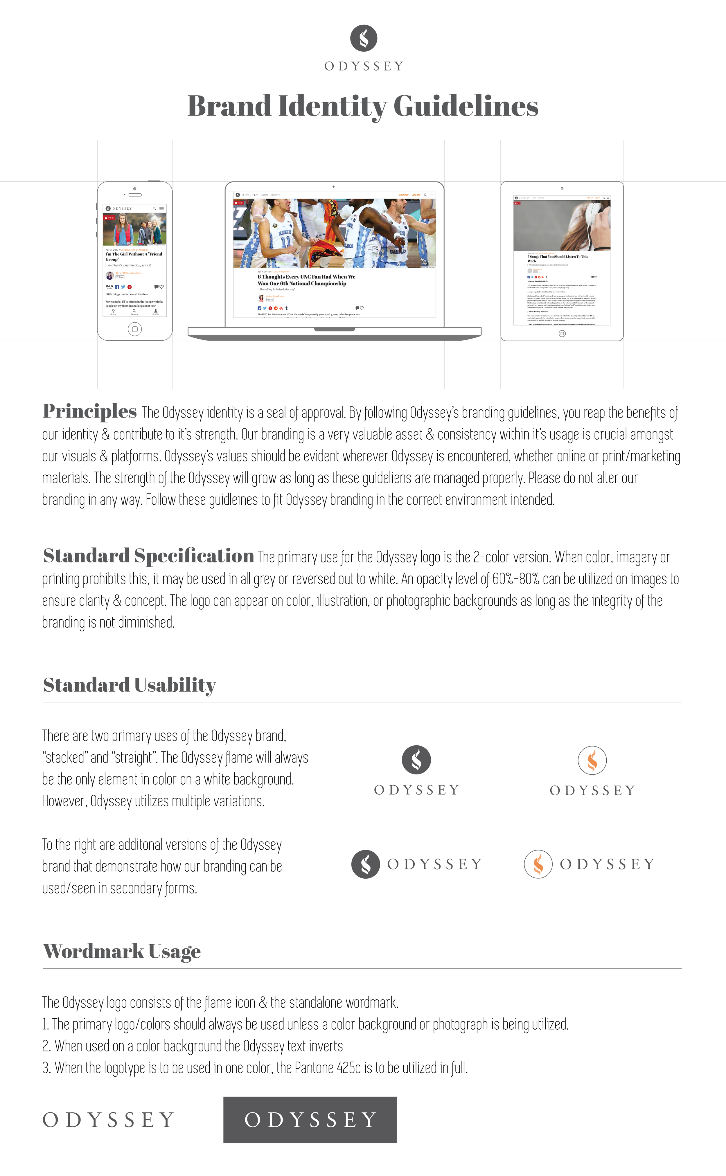
The principles.
The Odyssey Media Inc. brand is grounded in innovation, connection, and forward thinking. The logo mark reflects these values and should be used consistently, preserving its proportions and integrity across all applications.
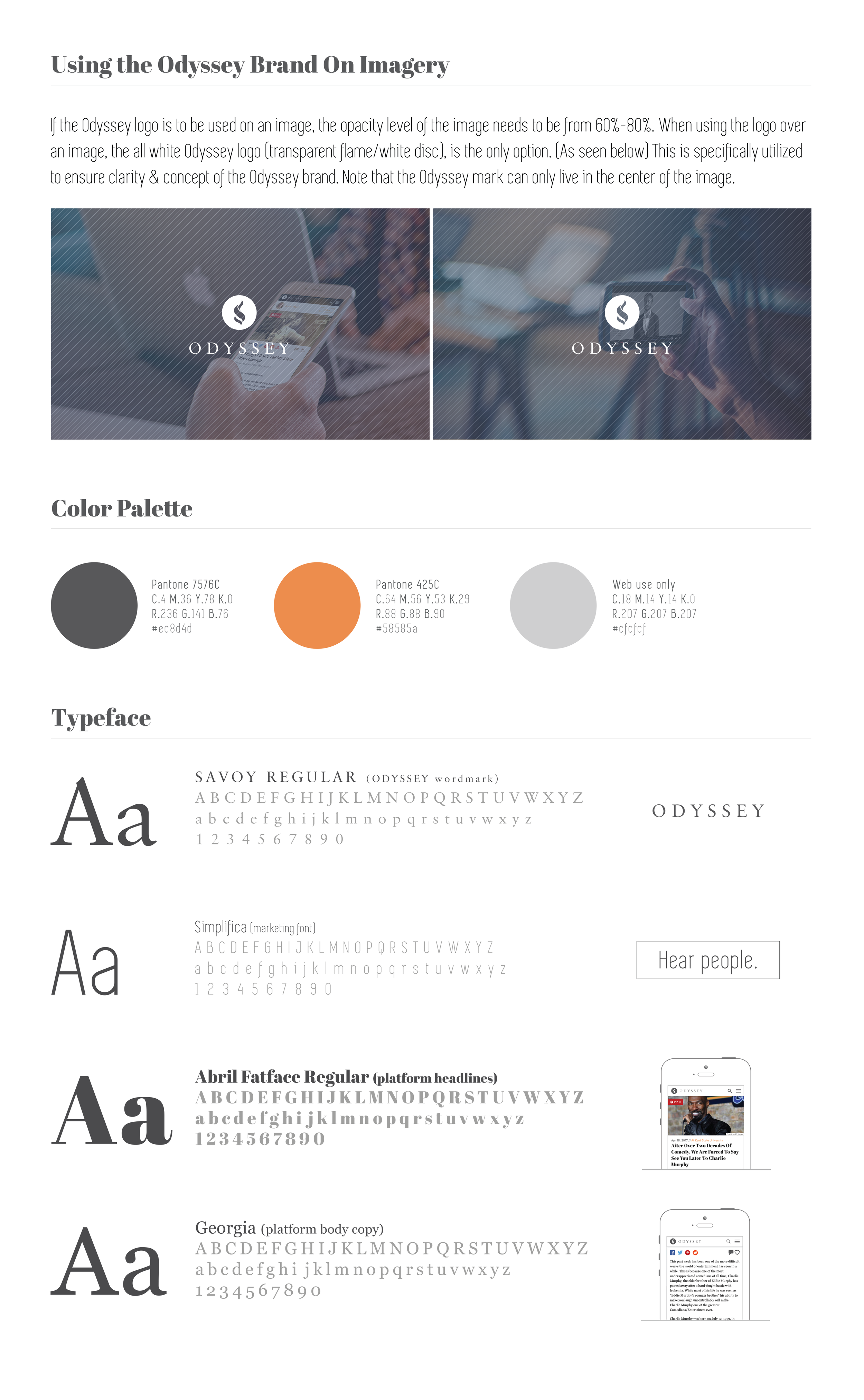
Visual unity.
Imagery and color bring the Odyssey Media Inc. brand to life, creating a visual language that feels bold, and cohesive. A purposeful color palette paired with engaging imagery builds recognition, adds energy, and creates a unified experience.
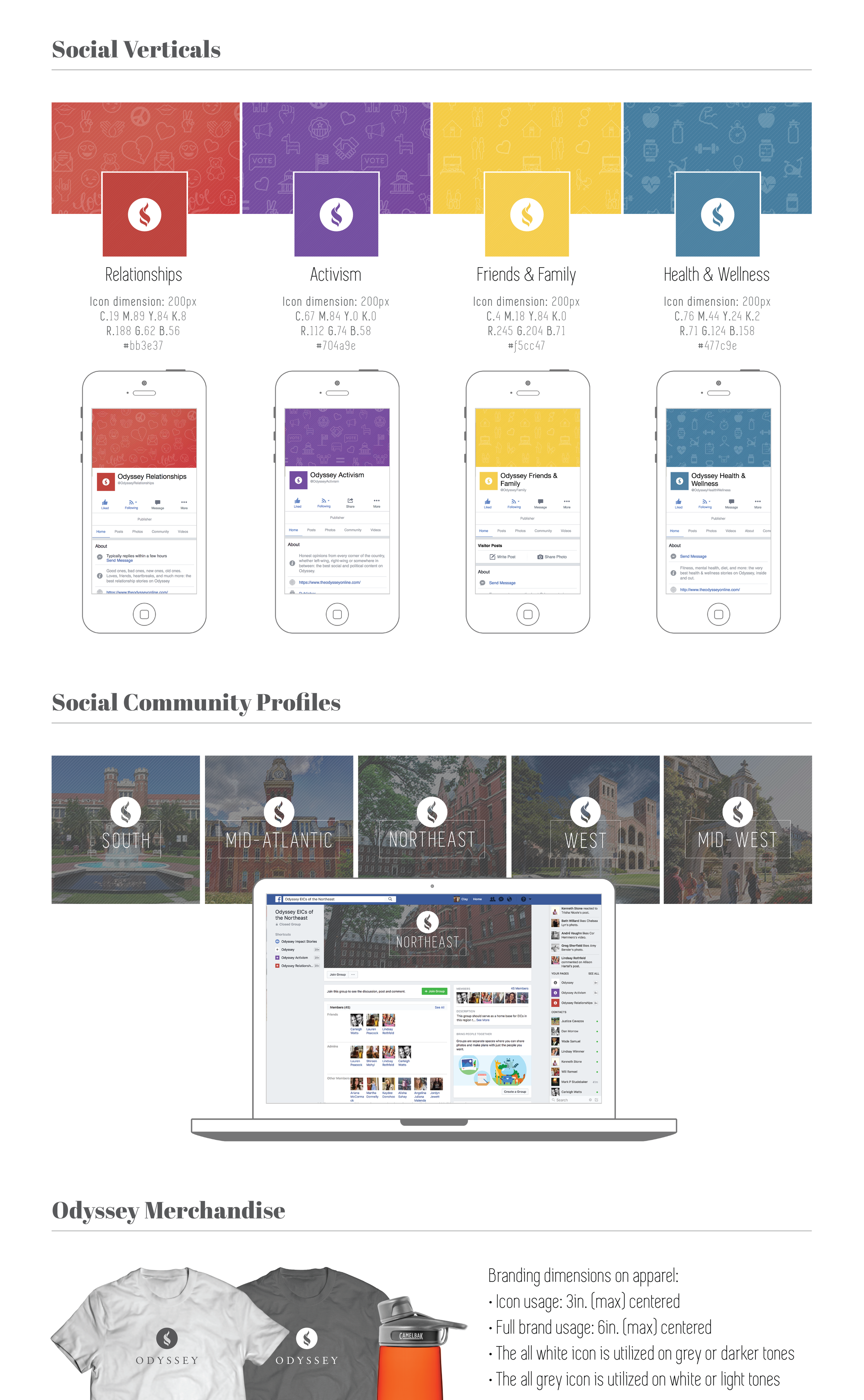
Social in motion.
The brand’s social verticals extend beyond the screen, creating meaningful opportunities to connect with and engage surrounding communities. Each channel reflects the company’s broader goals through relevant content, and local storytelling.
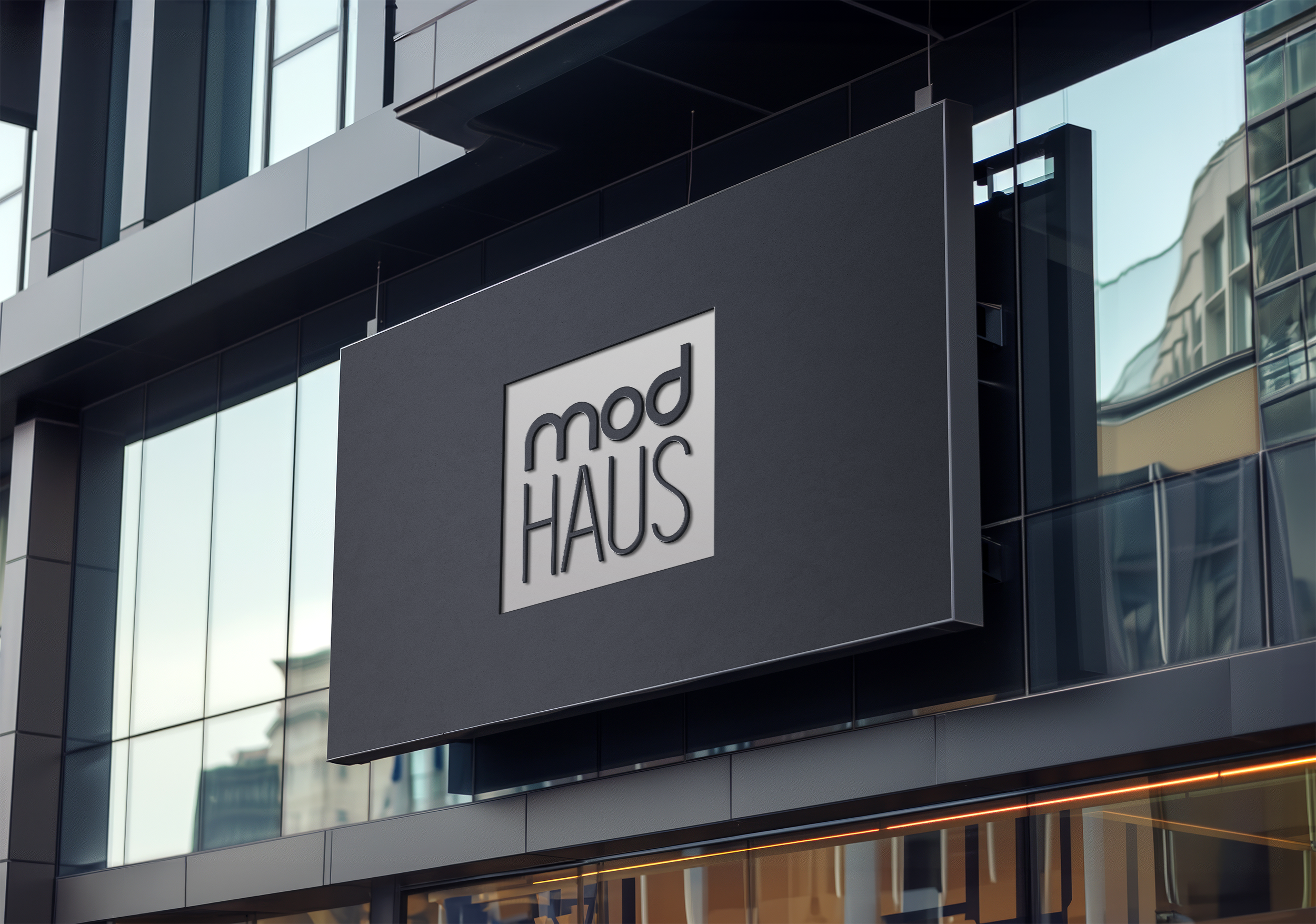
Minimal design. Lasting impact.
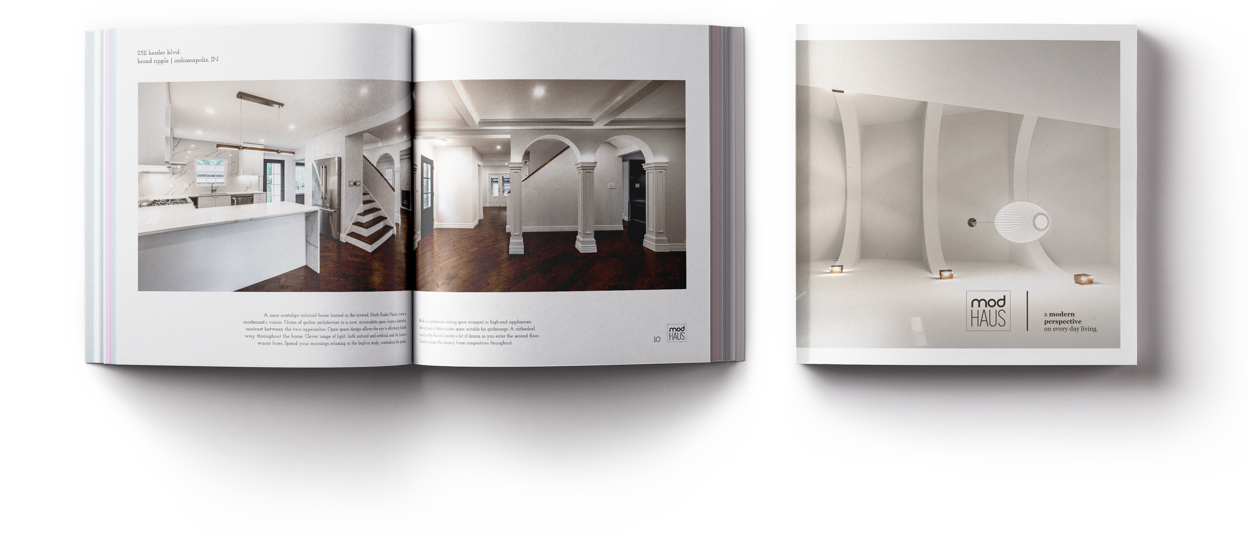
Where architecture becomes brand.
The modHAUS brand was created to embody a philosophy of timeless modernism, thoughtful architecture, and accessible design. We developed a visual identity rooted in minimalism and restraint, allowing the work itself to take center stage while creating a distinctive and recognizable presence. From the typography and color palette to the brand’s tone and visual language, every element was designed with intention. Reflecting the passion, precision, and craftsmanship that define modHAUS.
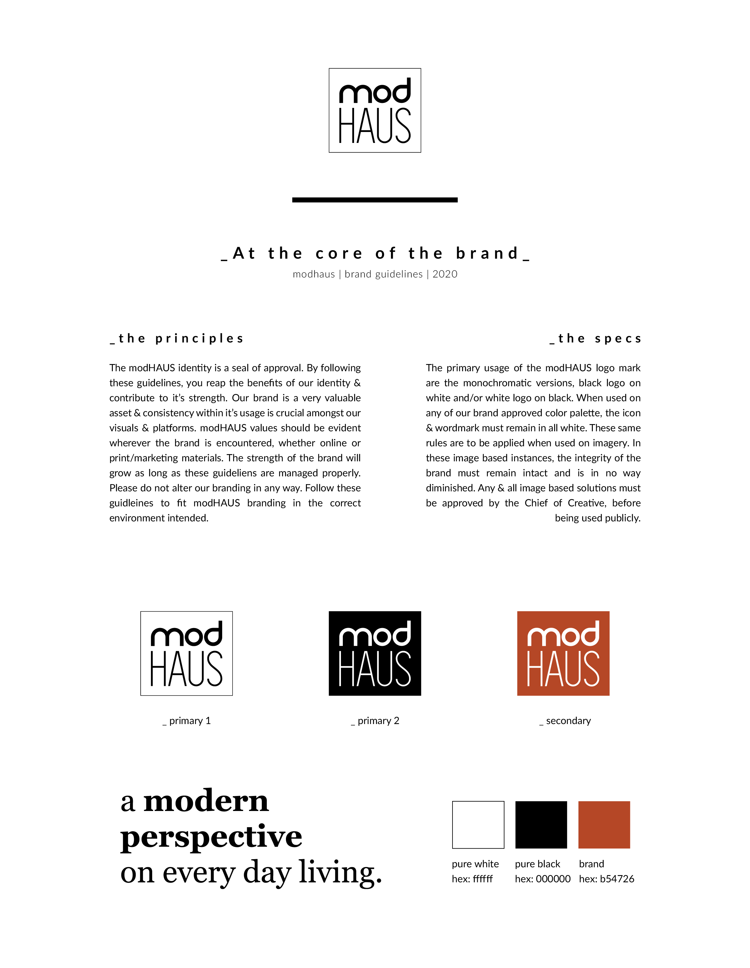
The framework.
The modHAUS brand guidelines establish a distinct visual point of view. Rooted in architectural precision and modern restraint, the system brings together font styles, palette, imagery, composition, and tone to create a brand that feels confident, elevated, and unmistakably modHAUS.
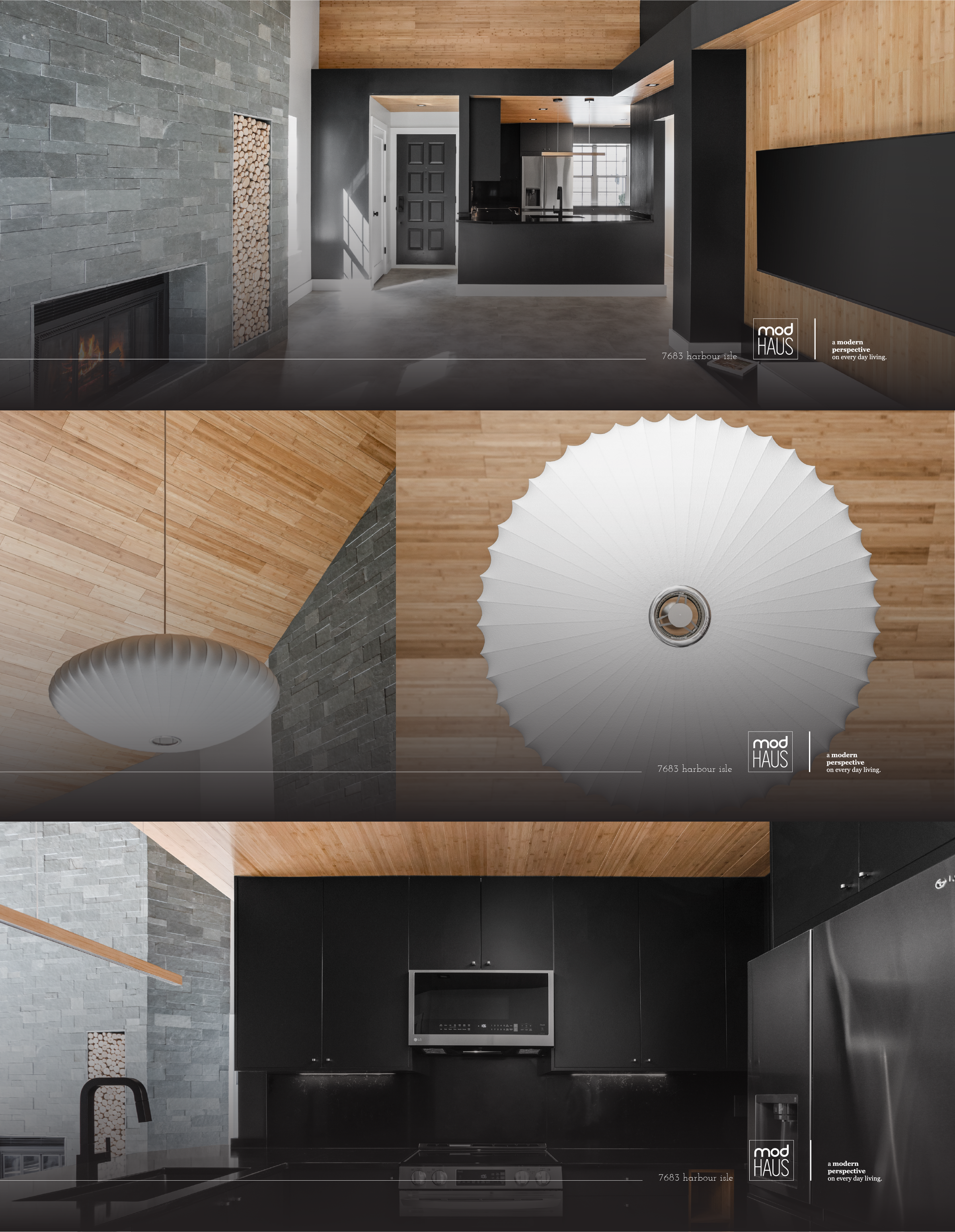
In context.
The modHAUS identity extends seamlessly into imagery, creating a distinct and cohesive visual language across every application. Thoughtful typography, refined graphic elements, and intentional composition complement the architecture without competing with it.
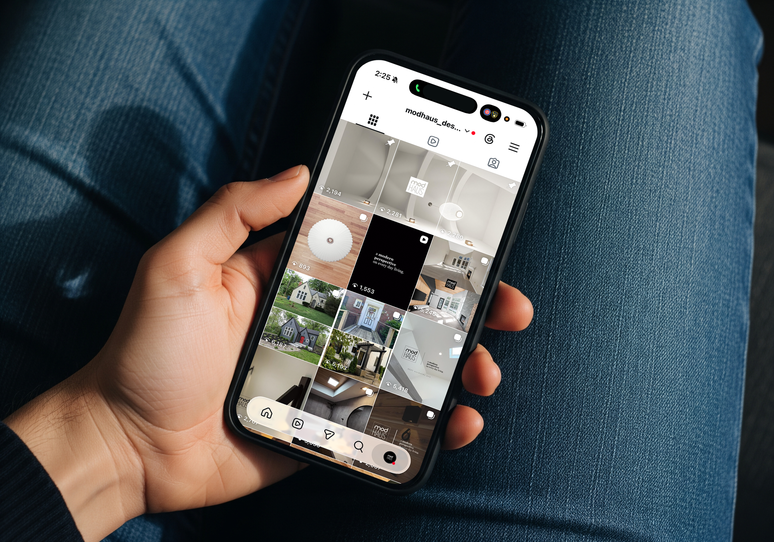
Social voice.
Consistency across social media was key to creating a cohesive modHAUS brand. A unified voice and visual language ensured every touchpoint felt intentional, recognizable, and aligned with the brand’s modern, minimal aesthetic.
Built for the elite.
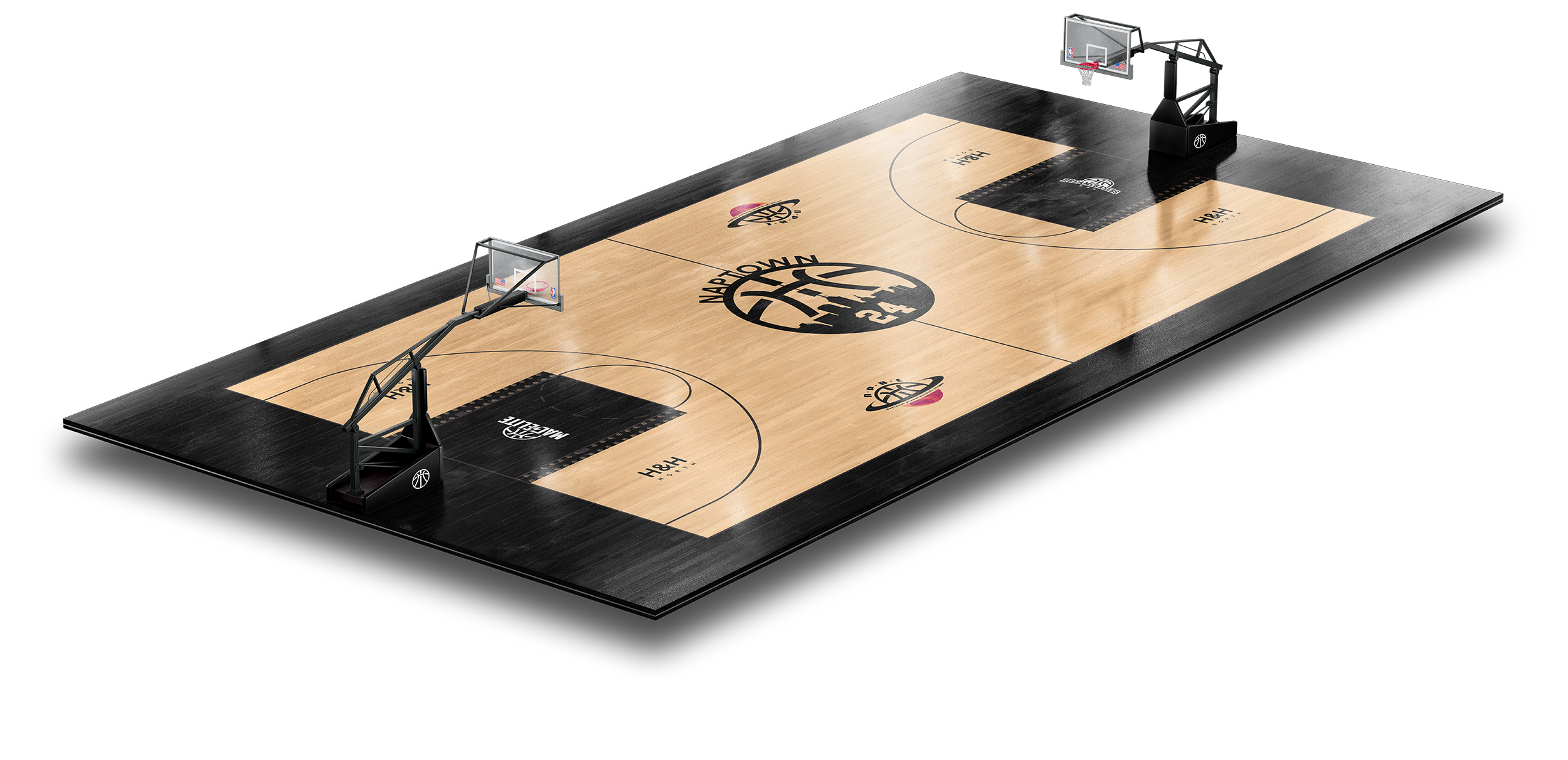
Designed to compete.
H&H is built for players who refuse to settle. Created with an uncompromising focus on performance, the gym provides an elite environment where serious athletes can train, compete, and elevate their game. Every element of the brand reflects that mindset—bold, focused, and built around the pursuit of getting to the next level.
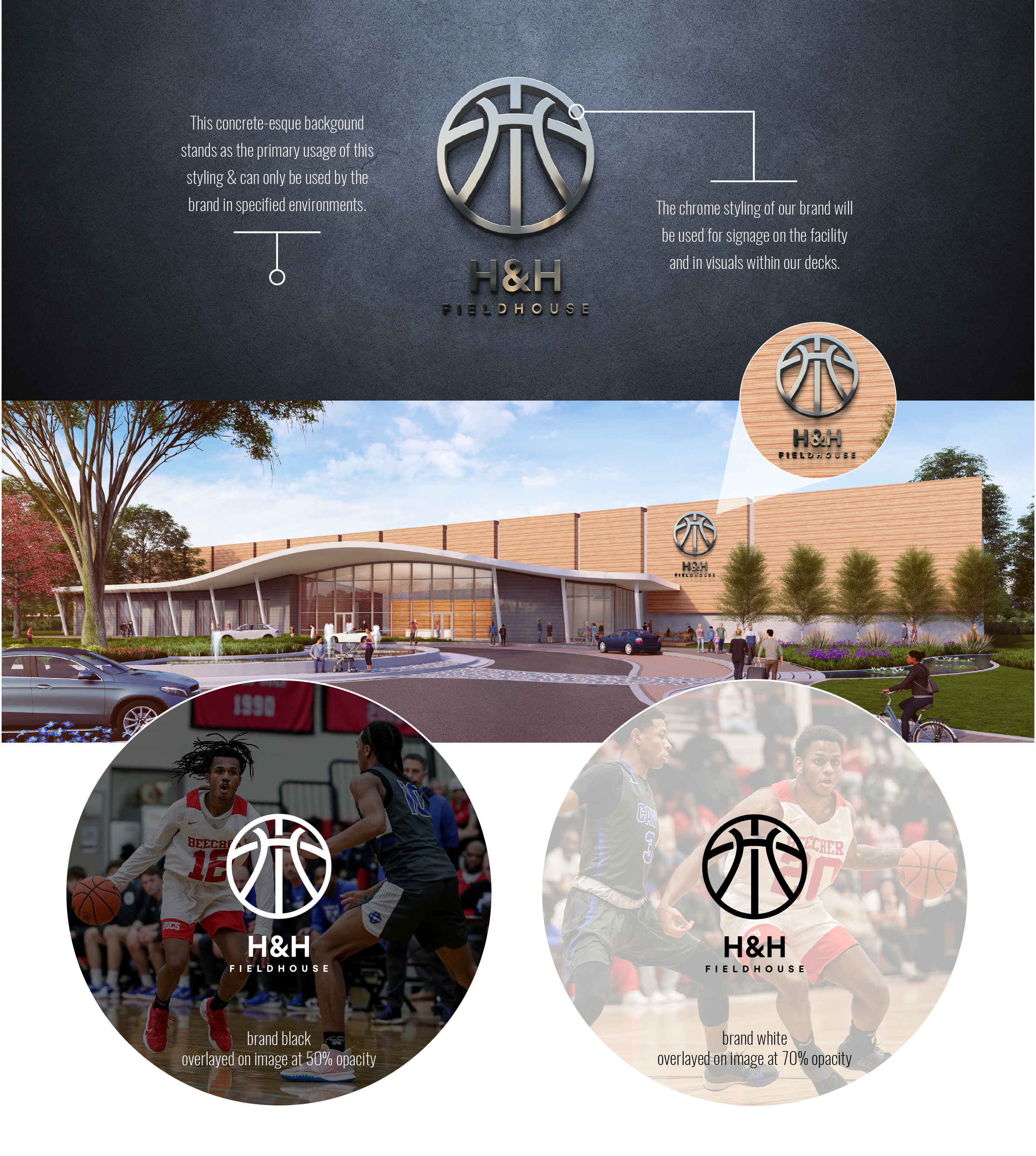
The mark.
The H&H icon is built through a deliberate system of geometry, proportion, and repetition. Its structured construction creates a balanced, recognizable form that feels distinctly connected to the rhythm and precision of the game. Every line and relationship is considered to give the mark strength, clarity, and versatility across the H&H identity.
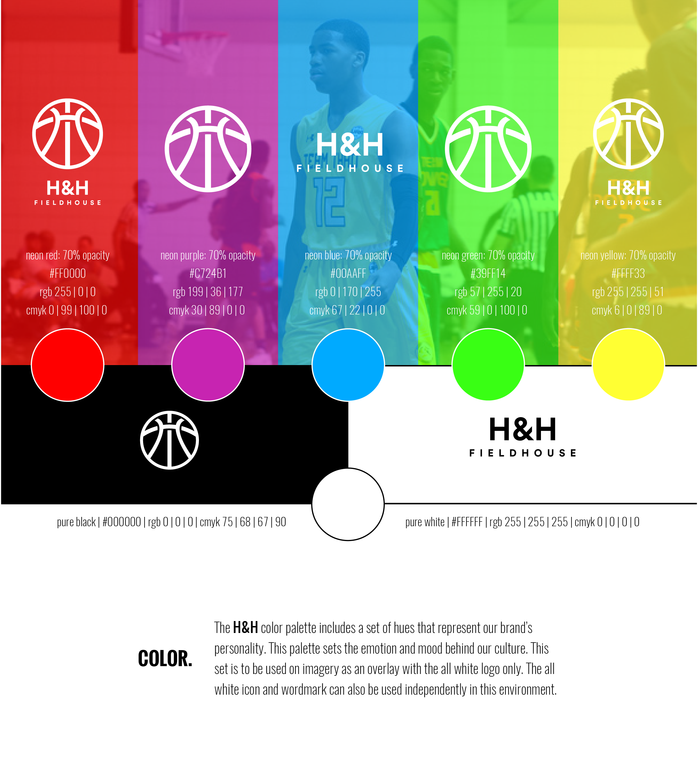
The palette.
The color palette is built to create a distinct, recognizable presence across imagery and marketing. Bold tones provide contrast and energy, while supporting colors add depth and flexibility. Applied consistently across photography, campaigns, digital, and apparel, the palette gives every expression of H&H a unified and unmistakable visual character.
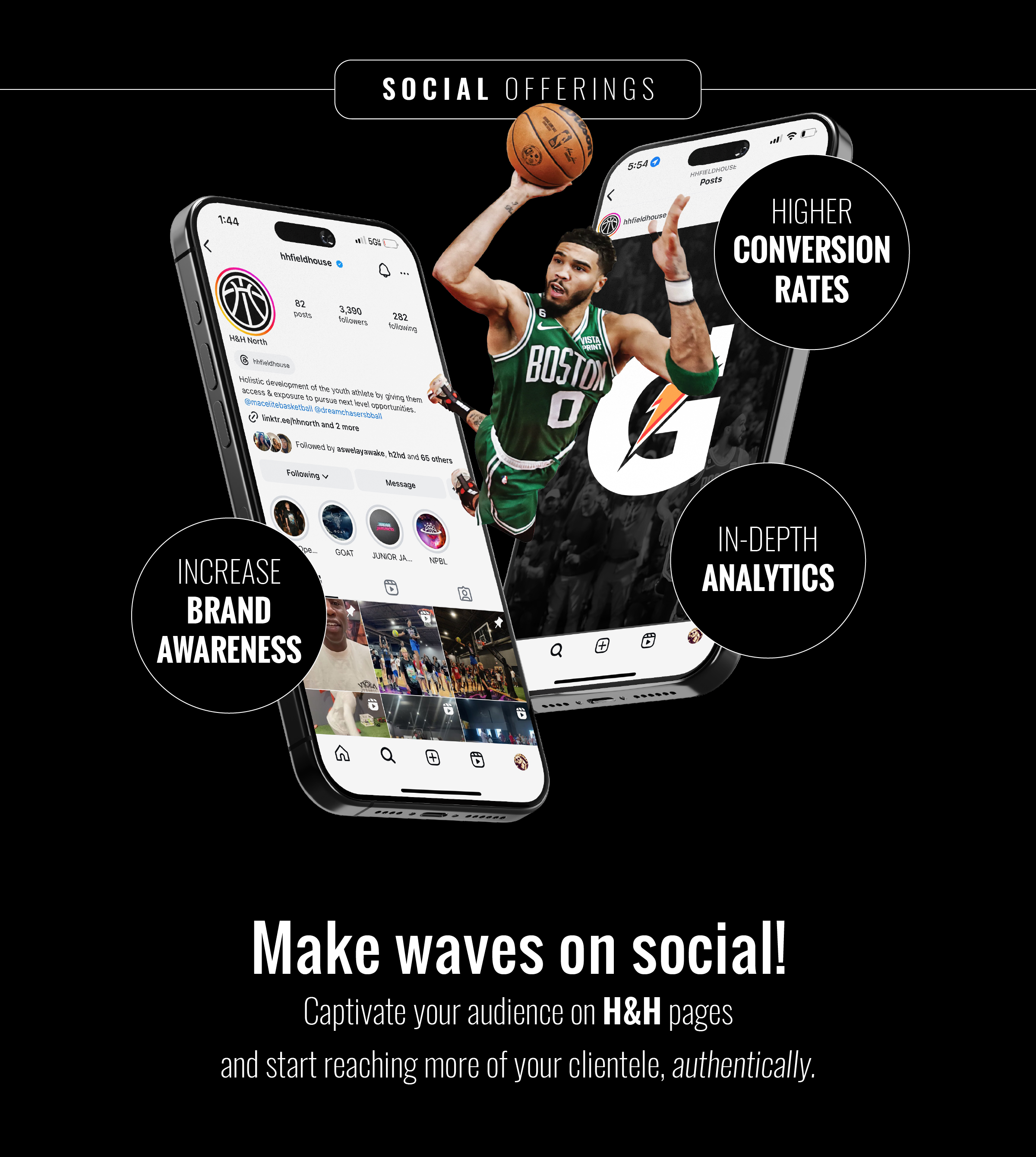
Always in motion.
The H&H brand extends across social media with the same energy and precision established throughout the identity. From photography and video, color, and messaging, each piece works in parallel to create a consistent visual language. This cohesion keeps H&H instantly recognizable while allowing the brand to feel active, competitive, and connected to the culture.
A premium offering within the broader brand.
GOAT represents the upper echelon of the brand—a premium product offering designed for those who demand more. Built around elevated performance, refined design, and exclusivity, GOAT pushes the core brand into a more aspirational space while maintaining a clear connection to its foundation.